01 / COMMUNITY PRESENCE
A welcoming community
Show the people and cultural life of the community right from the start.
Connect.Celebrate.Belong.
IGUNU is a community for Indians living in Ulm, Germany. I redesigned its website to make events, membership details, and community information easier to find.
Explore the redesign ↗The old website had useful information, but some important details were difficult to find. Membership information was not easy to compare, and events were mixed with regular posts.
Our goal was to make the website easier to explore and give the community a more welcoming online home.
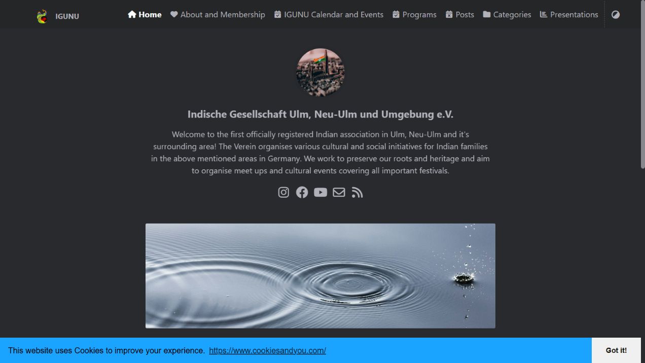
The homepage had a brief text welcome and an administrative post feed, giving little visual presence to the people behind it.
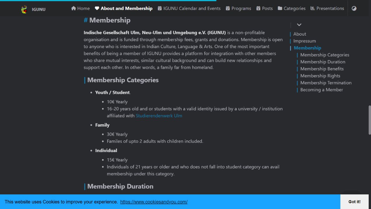
Membership options and fees were listed within a long article on an About page, making it hard to compare options.
Community gatherings and festivals were scattered across blog posts rather than having a clear place.
Design observations from the original website. The interactive before/after viewer below allows side-by-side exploration of the live pages.
Show the people and cultural life of the community right from the start.
Familiar roots.
A fresh expression.
Warm colours, clear type, and open spacing to make the pages easy to read and inviting.
Comparing the original website with the redesign.
Matching pages at the same screen size.
Home · Desktop · Side by side
Scroll within either frame to explore. Choose Before or After for a larger view, or open either website in a new tab.
Before: The website shared information but did not clearly show the community's personality. After: We used warmer visuals and clearer sections to make the community feel more welcoming.
Before: The website shared information but did not clearly show the community's personality.
After: We used warmer visuals and clearer sections to make the community feel more welcoming.
Before: Membership details were harder to compare.
After: We organized membership options so visitors could understand the details more easily.
Before: Events were mixed with other posts.
After: We gave events a clearer place so visitors could find upcoming activities.
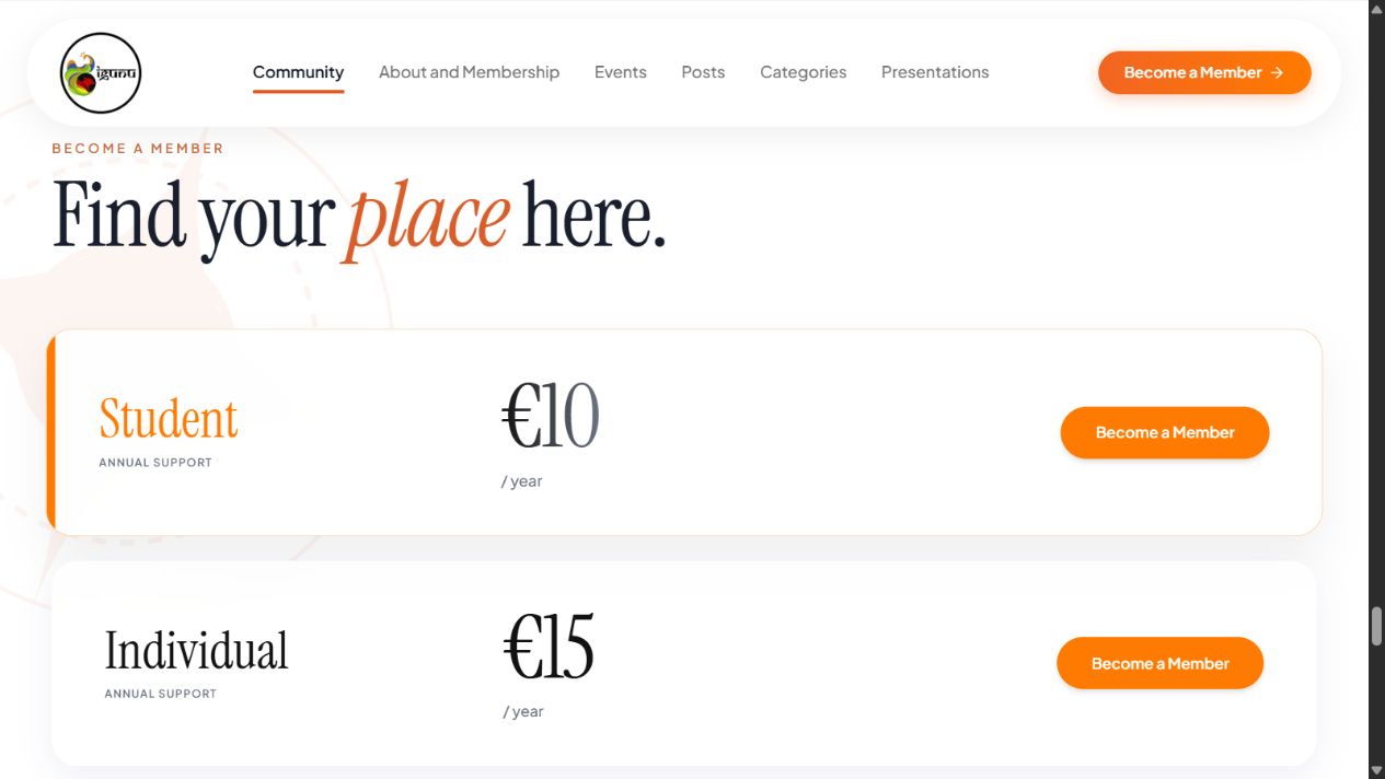
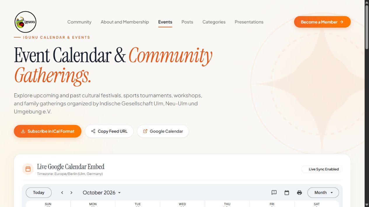
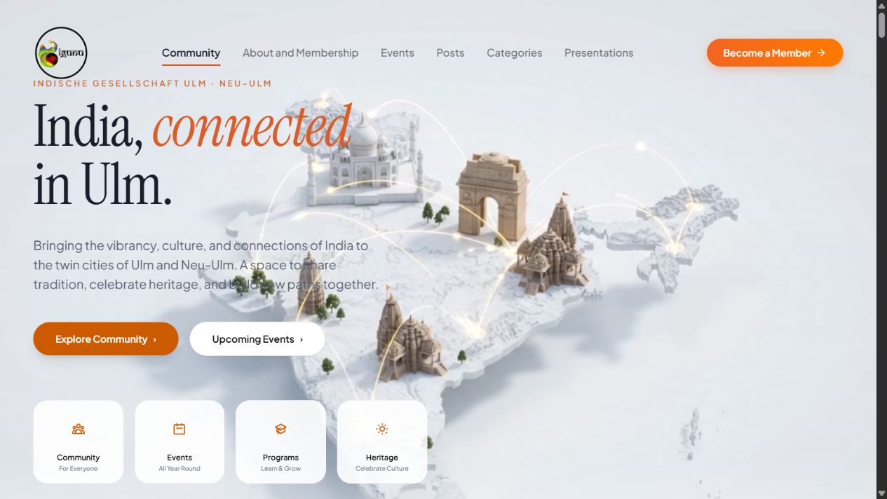
Captured screens from the redesign. Use the Before / After section above to compare complete interactive pages.
Fonts, colours, and components used in the redesign.
The community logo placed in a clean, spacious layout.
Aa.
India, connected.Clear words.
Warm connections.
Select a swatch to copy its value.
Rounded cards, clean white surfaces, and warm orange accents to guide visitors.
Interface specimens, recreated from the redesign styling.
I used photos, spacing, and gentle movement to make the website feel more lively.
Clean white cards and gentle shadows give the layout structure without feeling busy.
Gentle animations bring life to the page while keeping it easy to browse.
This project showed me that a community website needs more than good visuals. People should be able to find events, understand membership, and feel connected to the community.
Good community design is about making everyday information clear so people can connect, join, and feel like they belong.
EXPLORE THE REDESIGNExplore the page layouts, interactions, and details on the test domain.
Open redesign preview ↗