WEEK 01
Discovery & Customer Journey
Reviewed usability issues in the original Google Apps Script order form. Mapped the main customer shopping journey across four steps: Find → Choose → Order → Track.
Bringing India
Home.
One business, two problems: making grocery shopping easier for customers and everyday store management simpler for the owner. I designed the online shop and helped organize daily order handling.
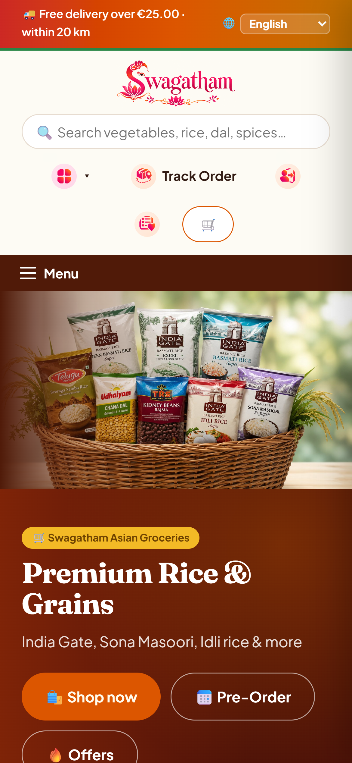
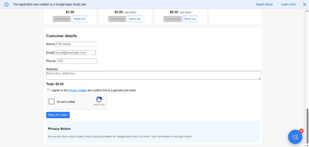
Swagatham originally relied on a single Google Apps Script order form. Customers navigated hundreds of unorganized items on one continuous page, creating a slow and cumbersome purchasing experience.
Simultaneously, store owner Vidhya handled frequent WhatsApp inquiries and compiled orders manually while balancing a full-time job.
This project addressed both sides of the business: designing an easy online shop for customers and simplifying daily store management for the owner.
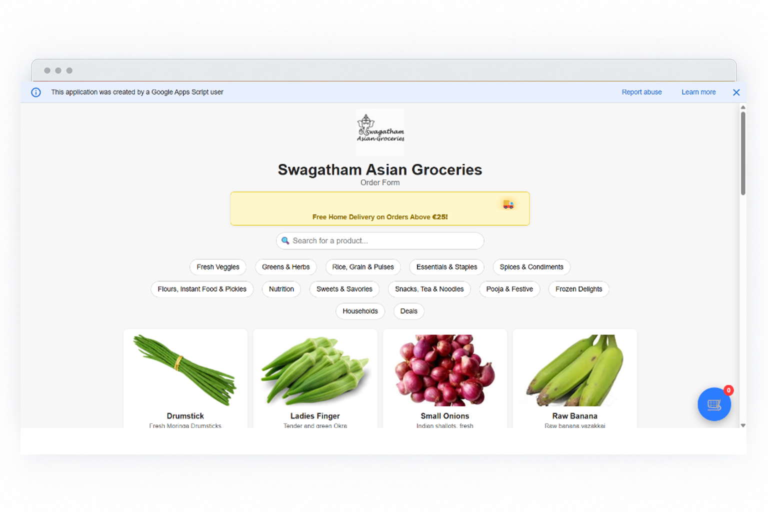
Customers could browse and select items, but the entire catalog was compiled into one continuous list, with customer details and order submission located at the very bottom.
I organized the catalog into clear grocery categories, dedicated product pages, simple guest checkout with cash on delivery, and easy order tracking.
Five weeks of design and prototyping, moving from a single order form to a live online store that is easy to browse and simple to run.
Audited the original Google Apps Script order form and mapped the primary customer journey: Find → Choose → Order → Track.
Organized hundreds of groceries into aisles (Rice, Spices, Flours, Staples) and search structure.
Explored brand marks, designed the Ganesha-inspired 'S' logo, and created a warm, culturally familiar visual identity.
Designed product detail cards, fresh produce pre-orders, local delivery zones, and guest checkout.
Assisted with frontend implementation and walked through everyday store operations with owner Vidhya.
Reviewed usability issues in the original Google Apps Script order form. Mapped the main customer shopping journey across four steps: Find → Choose → Order → Track.
Reorganized the flat product list into familiar Indian grocery aisles (Rice, Flours, Spices, Staples). Began initial logo explorations inspired by Indian cultural symbols.
Finalized the Ganesha-inspired 'S' logo and warm color palette. Began designing product cards, clear pack sizes, and mobile navigation.
Designed the guest checkout with cash on delivery, weekly fresh produce pre-order flow, and local delivery zone schedules. Initiated implementation support for frontend build.
Added self-service order tracking. Walked through real ordering and pre-order scenarios with store owner Vidhya, preparing the store for launch at swagatham.de.
I organized the store around clear grocery categories and a simple four-step customer journey: Find → Choose → Order → Track.
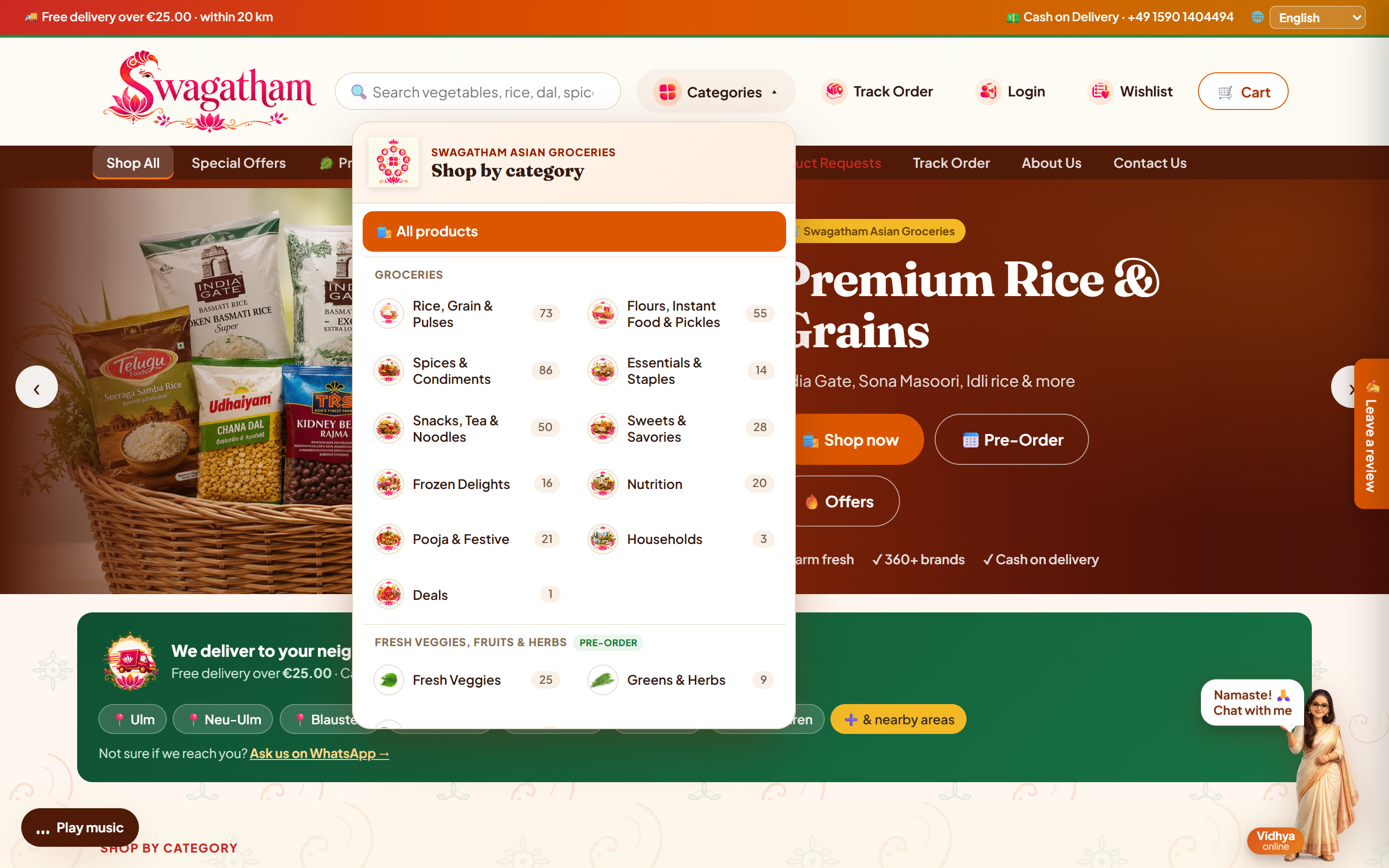
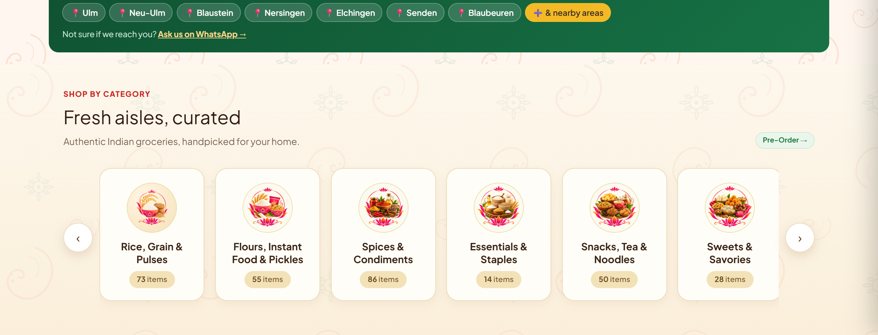
Product discovery and category navigation
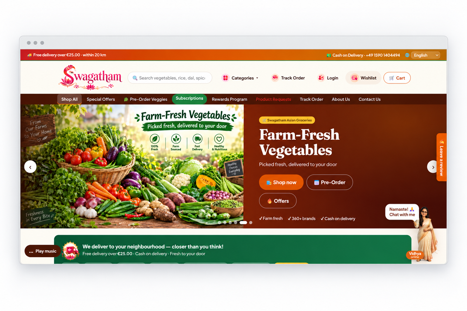
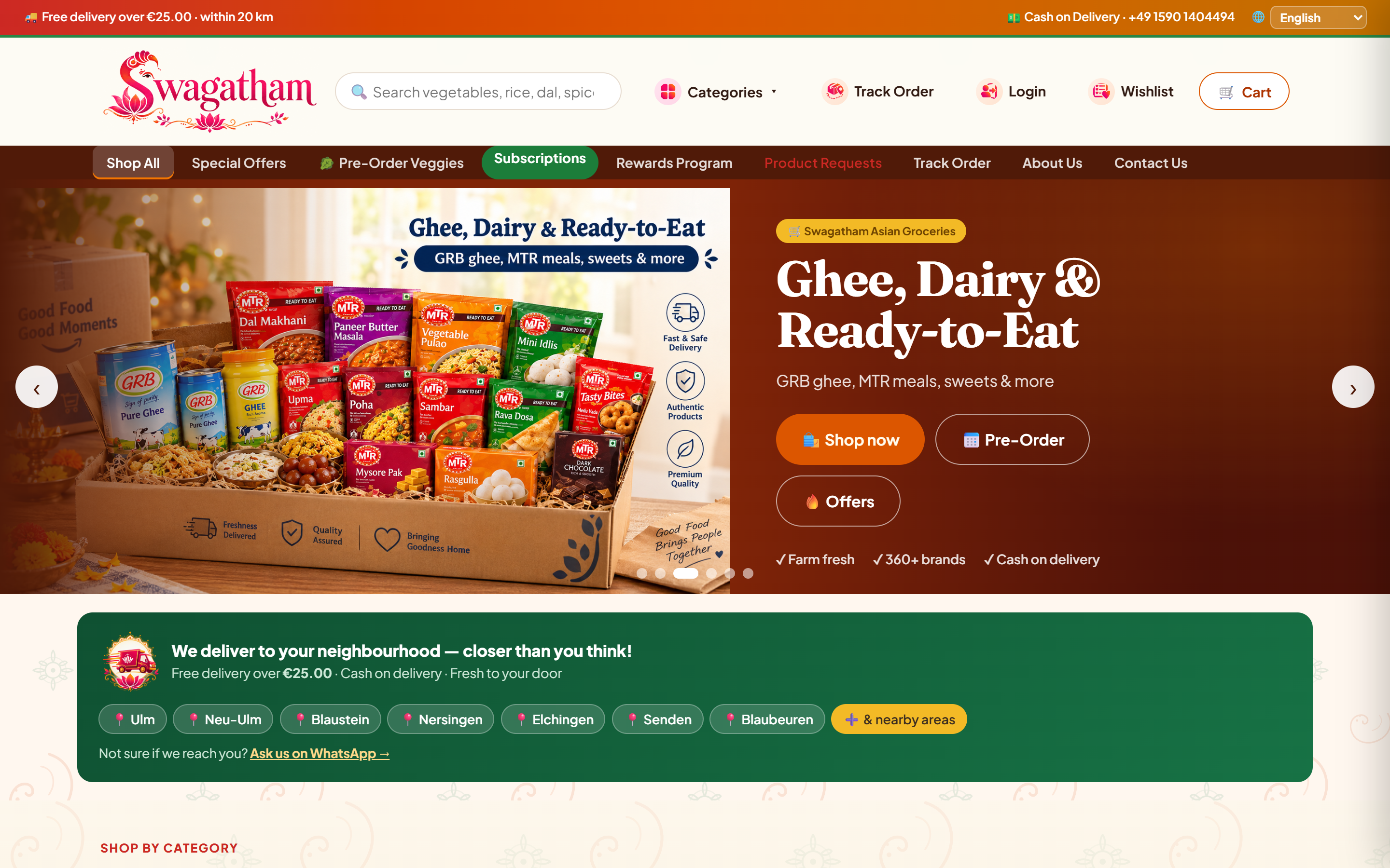
Featured groceries, delivery coverage, and current offers
Culturally familiar aisles: Rice, Flours, Spices, Snacks & Staples
Keyword search with instant product availability
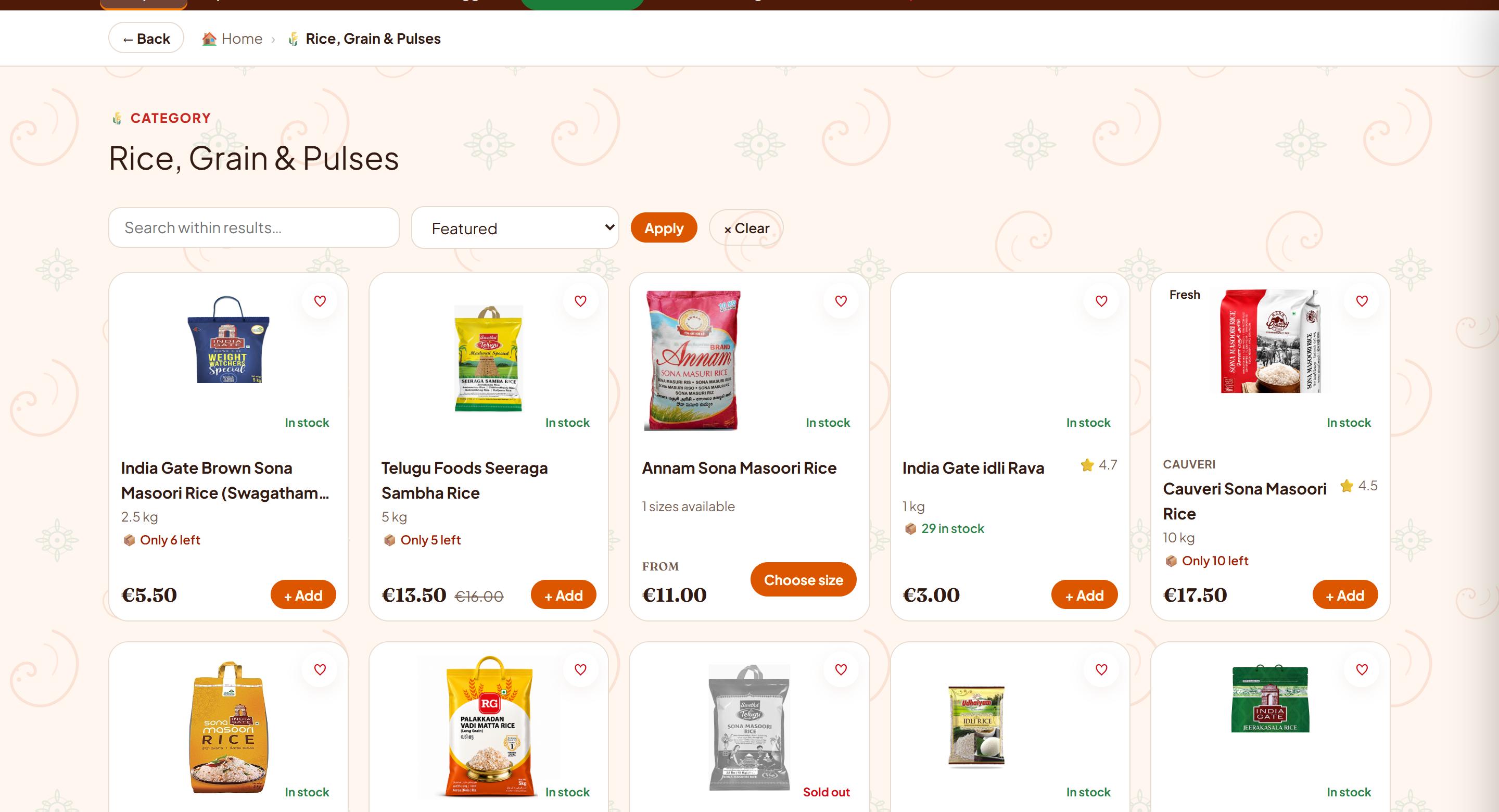
Product evaluation, pack sizes, and inventory
Category catalog with pricing, stock indicators, and quick-add actions
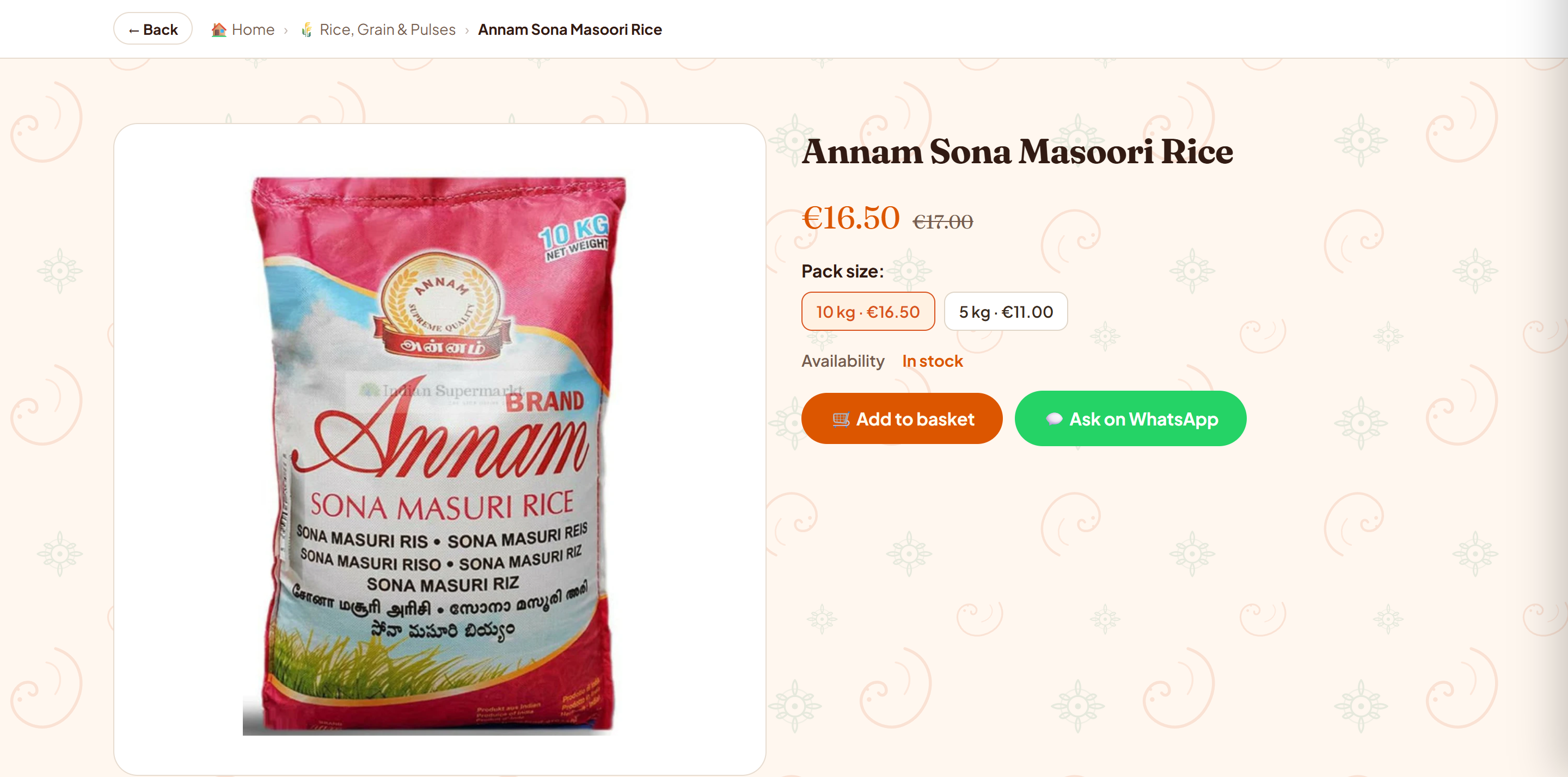
Item specifications, ingredients, and inventory status
Pack weight selector with corresponding price adjustments
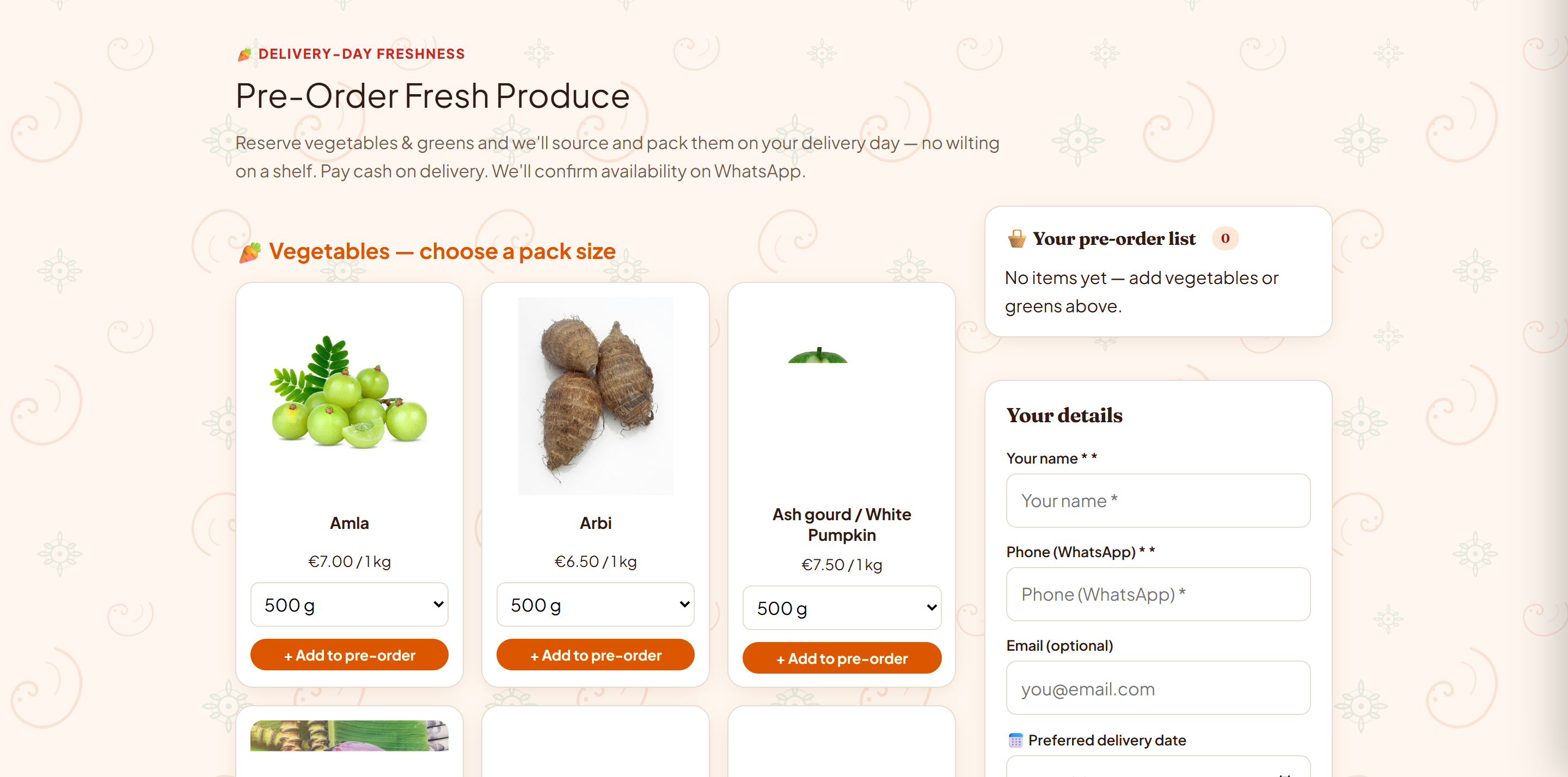
Advance reservations for delivery-day seasonal produce
Cart validation and order placement
Item summary, quantity selectors, and minimum order check
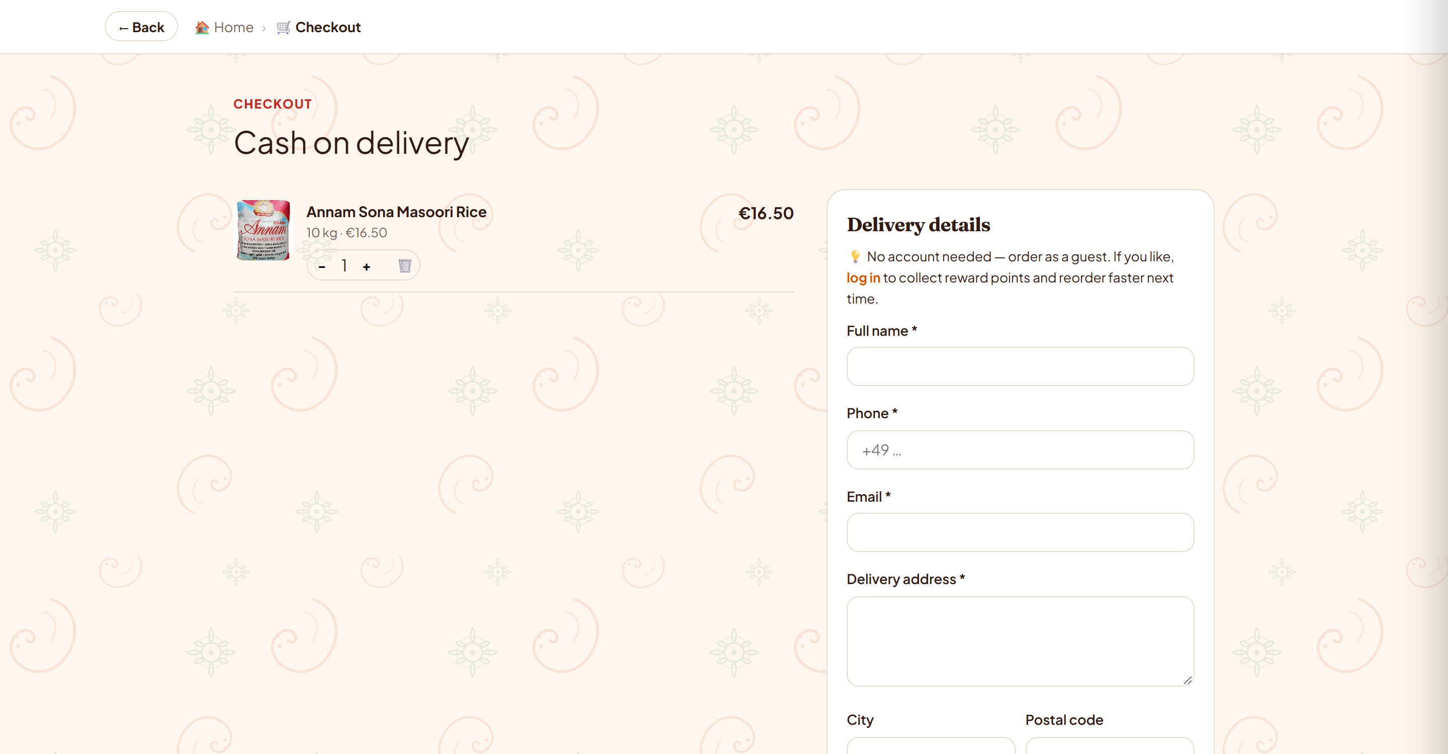
Simple address entry without requiring an account
Covered delivery towns and cash-on-delivery details
Post-purchase tracking and customer support
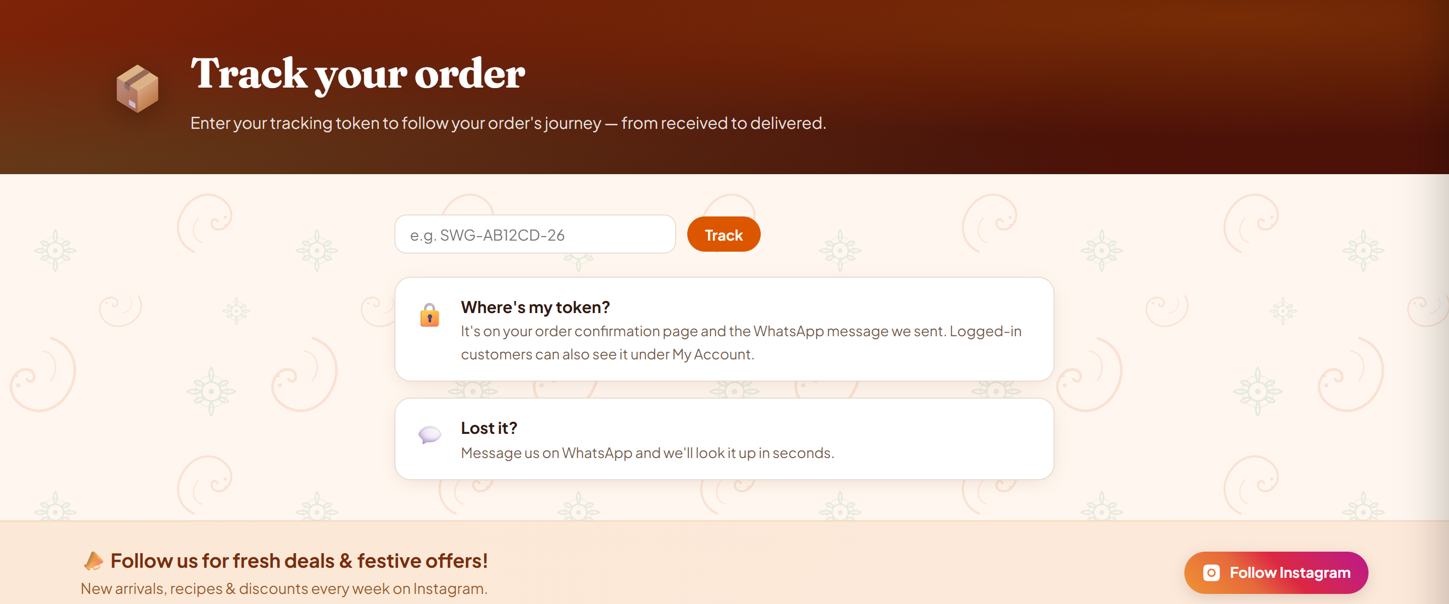
Order status lookup using unique tracking tokens
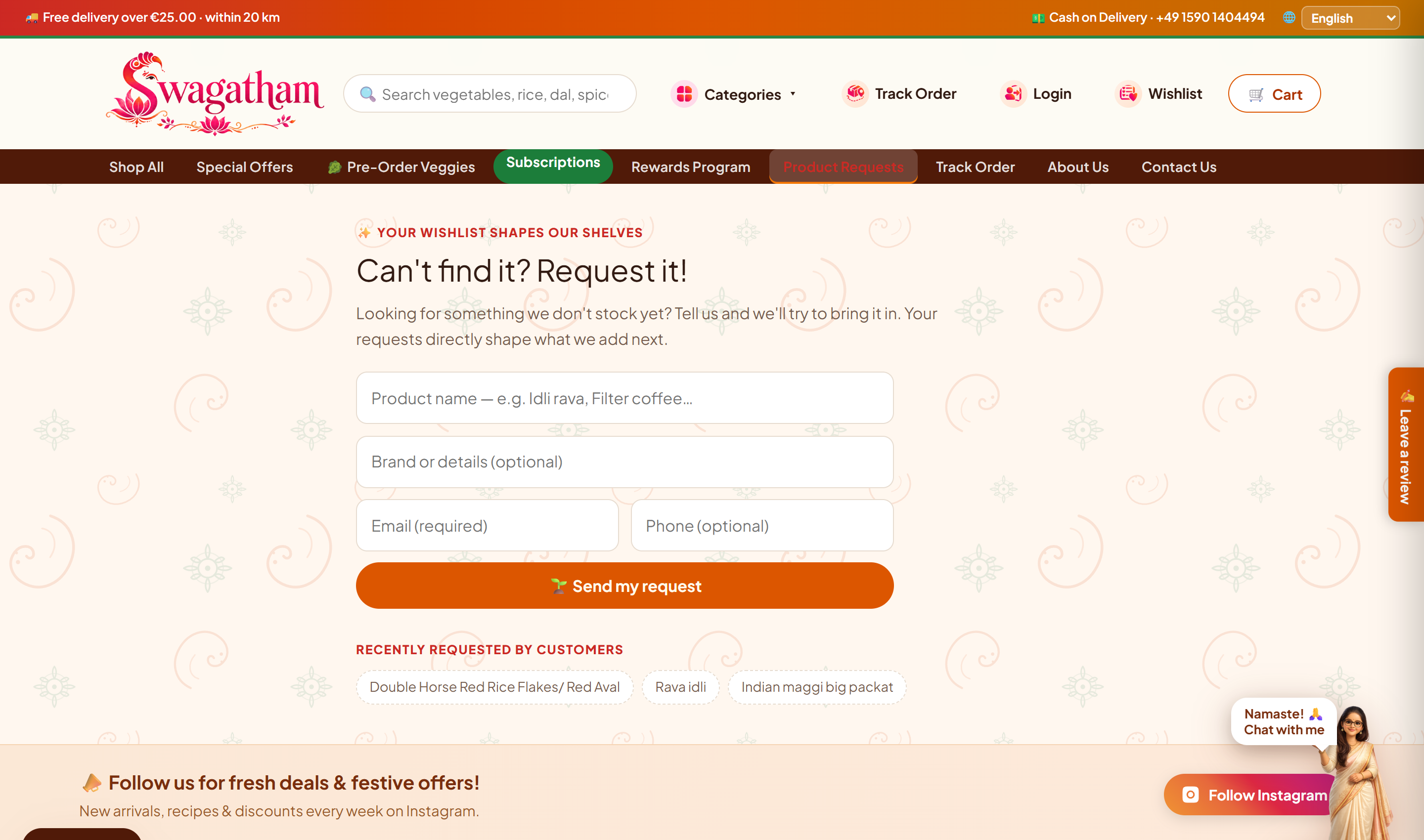
Request form for items not currently in the catalog
Search for ingredients or navigate familiar grocery aisles.
Compare pack sizes, check stock, and see prices before adding items to the cart.
Order with cash on delivery without needing to create an account.
Look up delivery and packing status using a unique order token.
Primary storefront architecture and customer shopping journey.
Swagatham translates to 'welcome.' The store owner needed an identity that felt warm and familiar to Indian families living in Germany.
I designed a brand identity around a Ganesha-inspired 'S' logo, paired with warm colors and the tagline, “Bringing India Home.”

“Bringing India Home.”
A simple promise: helping Indian families in Germany find familiar regional groceries and everyday ingredients.
Explored over 50 logo sketches to balance traditional cultural motifs with clear readability on digital screens.
A Ganesha-inspired silhouette within the letter 'S'—providing a clear, recognizable mark for the website and packaging.
From finding groceries to checking delivery status, three core design decisions made shopping straightforward.
Context & Problem: The original Google Apps Script form listed hundreds of groceries in one long list without categories or search, making it slow to find specific items.
Design Intervention: Grouped items into clear grocery categories (Rice, Flours, Whole Spices, Everyday Staples) and added keyword search with clear in-stock and out-of-stock indicators.
User Impact: Customers can quickly search or browse by category instead of scrolling through the entire catalog.
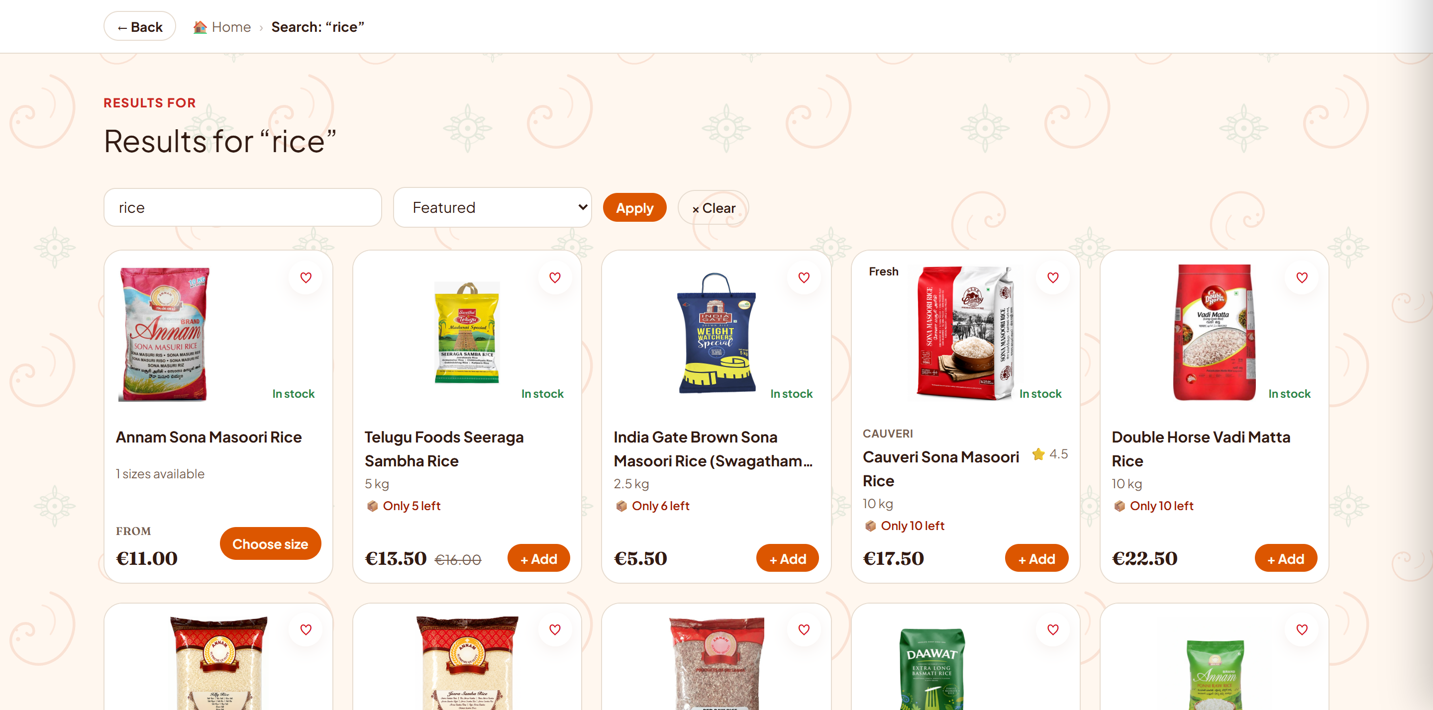
Shoppers can compare pack sizes, check availability, and see total prices before adding items to their cart.
Context & Problem: Requiring customer accounts adds unnecessary friction for a local grocery store, while fresh weekly produce needed an easy way for customers to pre-order before stock arrives.
Design Intervention: Created a simple guest checkout asking only for name, address, and phone number with cash on delivery, alongside a dedicated pre-order page for weekly produce.
User Impact: Customers can order quickly without creating an account or remembering a password, and the owner can plan weekly produce orders in advance.
Context & Problem: The owner received repeated WhatsApp messages from customers asking if their address was covered for delivery and when their order would arrive.
Design Intervention: Clearly listed covered delivery towns (Ulm, Neu-Ulm, Blaustein) and cash-on-delivery terms upfront, and added an order tracking page using unique order tokens.
User Impact: Customers can check delivery areas and look up their own order status anytime, reducing basic support questions for the owner.

Behind every order was a store owner balancing deliveries, stock, and customer messages alongside a full-time job. Making shopping easier for customers was only half the job—the owner also needed a practical way to manage daily store operations.
Problem: Orders arrived through both spreadsheets and WhatsApp messages, requiring slow manual copying to make packing lists.
Design focus: Grouped orders into a single packing list to make packing boxes and preparing deliveries simpler.
Problem: Updating product stock and totaling fresh vegetable pre-orders required editing spreadsheets by hand.
Design focus: Made it easy to turn items in or out of stock and total up pre-orders before ordering from suppliers.
Problem: Planning delivery stops across Ulm, Neu-Ulm, and Blaustein during evening hours required constant back-and-forth messaging.
Design focus: Organized orders by neighborhood to help plan efficient delivery routes and clearer drop-off times.
Internal management screens and business records are omitted to protect store privacy and business confidentiality.
We reviewed key shopping and store tasks through walkthroughs with the store owner. Below is what was evaluated together, what launched at swagatham.de, and what should be tested next.
Reviewed key shopping and store tasks with the store owner—checking category structure, pack sizes, delivery areas, and produce pre-orders against real daily operations.
The live store at swagatham.de, with organized grocery categories, product search, simple guest checkout with cash on delivery, and self-service order tracking.
Testing with more customers to observe their shopping experience, tracking checkout completion, and gathering feedback after deliveries.
I mapped the end-to-end shopping journey (Find → Choose → Order → Track) and organized the catalog into clear grocery categories.
I designed product pages, pack-size selectors, stock badges, delivery area details, and a simple guest checkout.
I developed the brand identity, designed the Ganesha-inspired 'S' logo, and created the warm color palette to reflect Indian culture and hospitality.
I assisted with frontend implementation, prototyping interactive components and helping prepare the store for launch.
Designing for two audiences: creating an easy, inviting shop for grocery customers while simplifying everyday order management for the owner.
This project showed that e-commerce design goes beyond the storefront itself. A store works best when it fits naturally into how the owner picks items, manages stock, and delivers orders alongside a full-time job. Good small-business design makes things easier on both sides of the counter.
Visit the live site to see the shopping experience firsthand.
From searching for ingredients to home delivery. Explore the complete screens across desktop and mobile.