KANBAN.
A simpler way to view tasks and track progress on mobile.
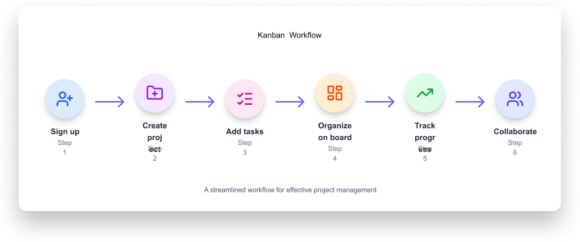
Kanban is a mobile task management design exercise. I explored how people could organize tasks, check progress, and manage projects on a smaller screen.
Making task management easier on mobile.
Task boards work well on large screens, but can feel crowded on phones. I wanted to explore a simpler way to view tasks and track progress.
The goal: Create a mobile design where people can quickly find tasks, understand priorities, and see what needs attention.
Reducing clutter
I kept cards clean by showing only key details, so the screen never feels overloaded.
Clear task stages
Clear columns help people see task stages at a glance and swipe easily between them.
Easier one-handed use
Placing key buttons and menus near the bottom makes them easy to reach with one hand.
Colours, spacing, and clear priorities
I used spacing, colours, and labels to help important information stand out without adding mental effort.
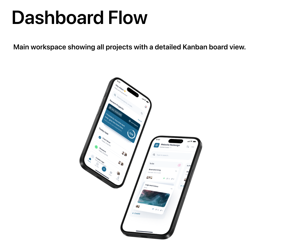
The Dashboard & Task Board
Each card shows important details so people can understand a task quickly. I explored ways to move between task stages without crowding the screen.
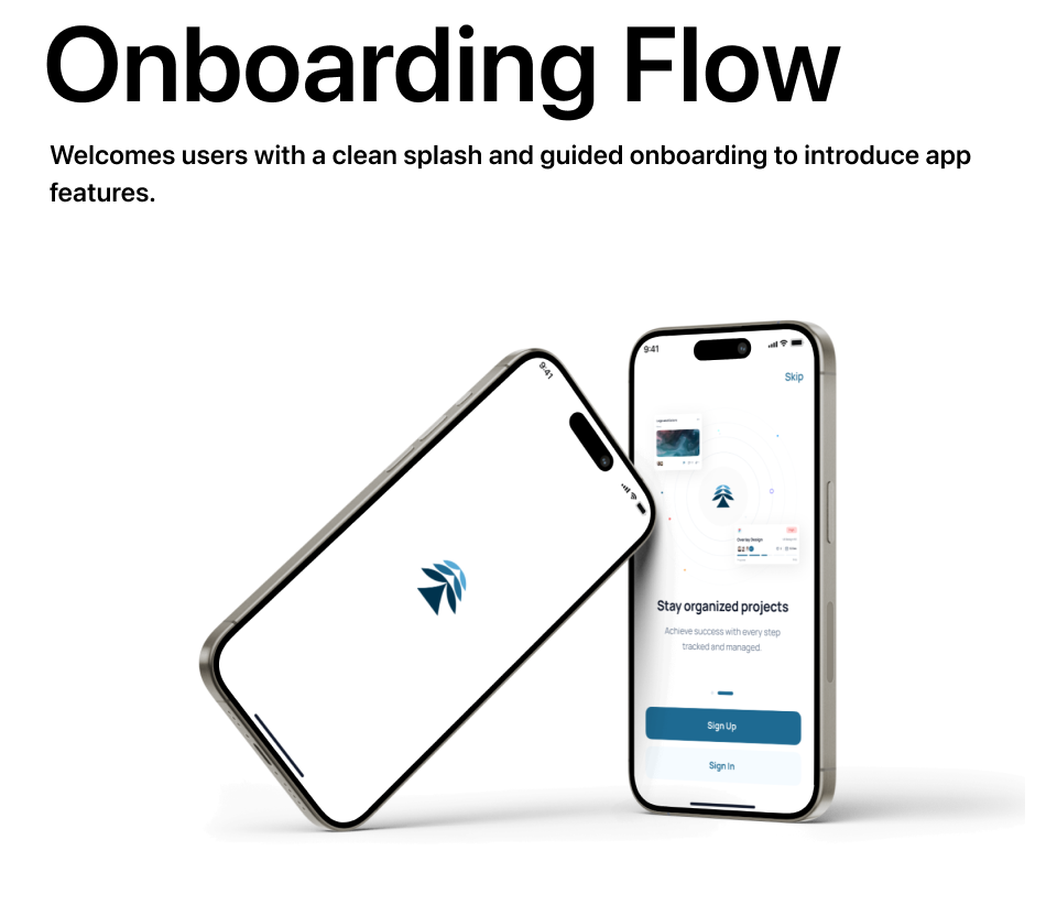
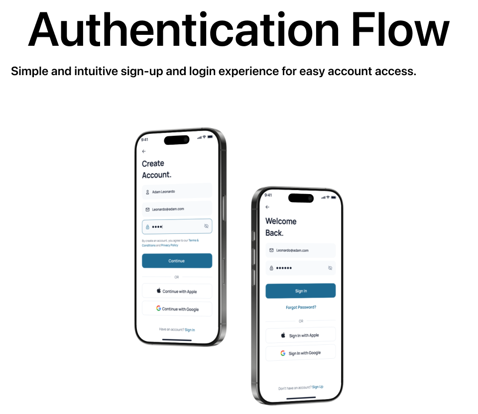
Getting Started
A clean start from the opening screen to signing in.
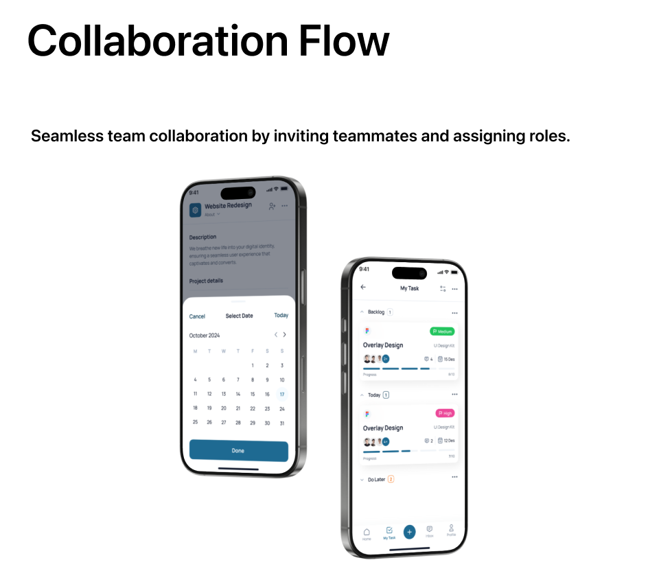
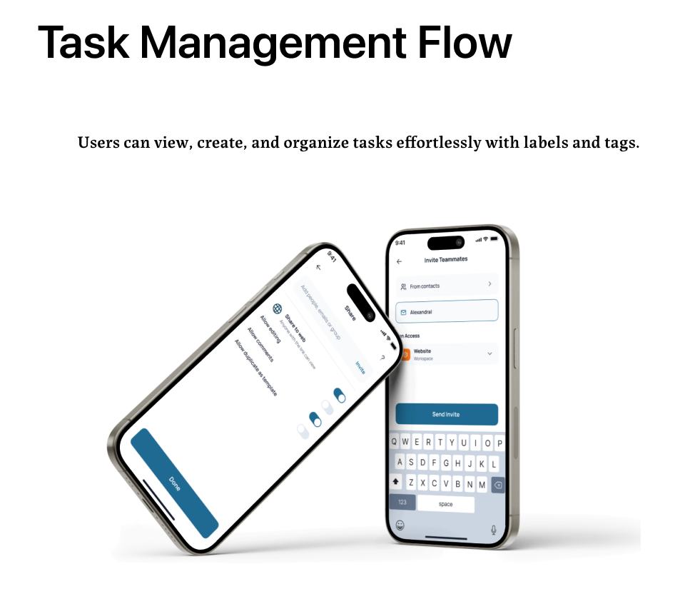
Scheduling and Sharing
Simple ways to set dates, organize tasks, and invite teammates with one hand.
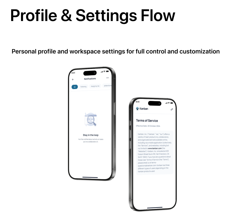
Notifications and Details
Keeping the same clean style across alerts and text pages.
What I learned.
This exercise helped me think about how much information should appear on a small screen. I learned to focus on clear layouts, useful details, and simple navigation.
01 / Clear layouts
Choosing what to show—and what to leave out—helps keep task boards easy to read on mobile.
02 / Useful details
Using clear colours, tags, and spacing helps people spot high-priority tasks quickly.
03 / Simple navigation
Placing key buttons near the bottom makes moving through tasks feel natural with one hand.